If you’re a graphic designer, a typographer, or an amateur font enthusiast, this might piss you off. That’s okay. Channel that anger towards flawless kerning.
I’ve seen people vomit because the Papyrus font was used for subtitles in Avatar, or get a boner every time a poster is in Helvetica. These people, they know they’re talking about fonts, right?1
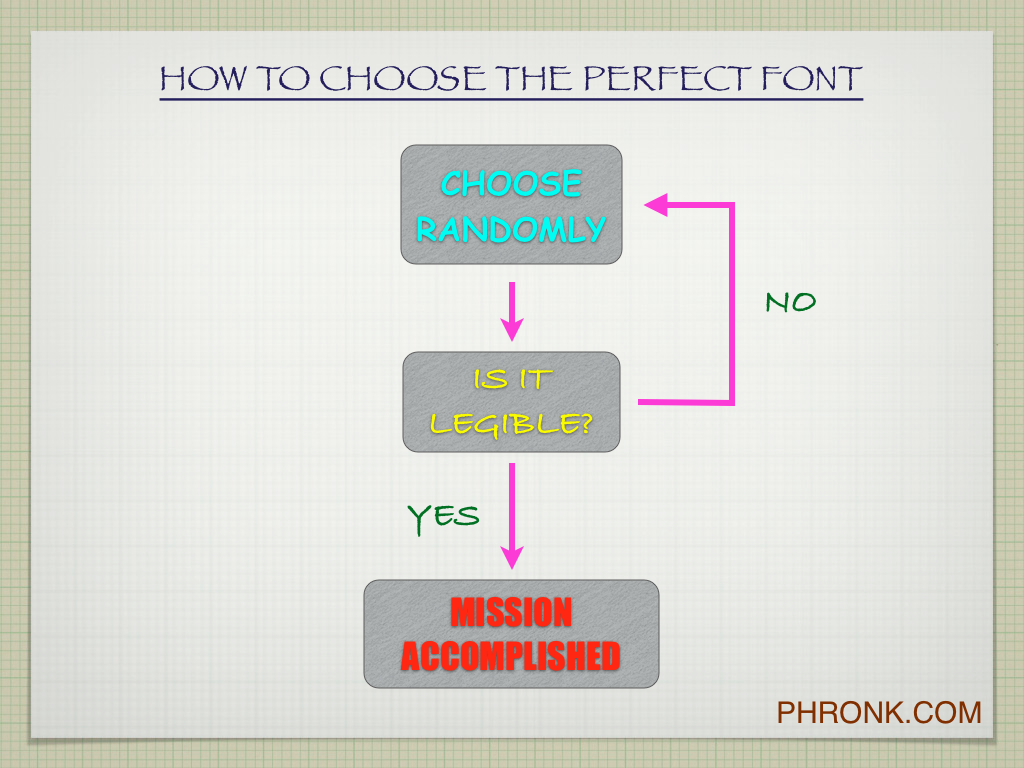
Here is a guide to simplify the judging of fonts:
 |
| Click for larger version, to print and hang on your wall. |
A font’s job is to display words. So sure, that means being neutral and getting out of the words’ way; cutesy curls and flourishes are excess. But it also means that as long as you can read the words, excess stylistic touches don’t matter at all. Just breathe.
Now that I’m done being provocative (and should it really be possible to be provocative about fonts?), let me back off a bit. Professionals working with displaying words put a lot of thought and effort into making and using nice fonts, as they should. I, too, like to surround myself with beautiful things, and some fonts are more beautiful than others. What I really mean to say is: to the average person (like me), we have only the tiniest subconscious aesthetic reaction to any given font. It barely matters.
What does matter is clear communication. It doesn’t matter what font you’re using if you still haven’t figured out how to use quotation marks, what an apostrophe does, or how double negatives work. A bad font doesn’t sink a well-written message. Bad writing, however, makes the most gorgeous font into gibberish. Focus effort on what matters first.
———-
1 E.g., here is an article that bitterly analyzes the personality of users of different fonts and celebrities that would probably use them. Here is a typo-ridden tirade against certain fonts. This is an entire blog devoted to banning Comic Sans.

Leave a comment